|
| |
 |
PDF files are preferred for its convenience, ubiquity and reliability. PDF files stay intact after file transfer, and do not require both the sender and receiver to have to exact same software version, computer platform, operating system, and font/language settings in order to open the file and preserve the artwork’s original settings. This is especially critical for export jobs, where software and font selections between two countries may be drastically different. For export jobs, we usually insist that customers send us print-ready PDFs.
Native files are also acceptable but run a greater risk of complications like missing fonts and images caused from software and O/S incompatibilities. Unlike PDFs, most layout software does not embed images inside the page document. Instead they have pointers to high resolution versions of images, which may be stored elsewhere. This could be on the original computer used to create the file or on another image server. Working with native files requires all of these variables to be taken into account in order for the files to flow through production problem-free. This is both risky and time-consuming. Types of files and software platforms we accept are below:
|
| Acceptable Software |
CorelDraw 、Quark4.0、Pagemaker、Photoshop、InDesign、Word、CS2~5
|
Acceptable File Formats |
jpg、tiff、psd、ai、gif、cdr、scitex ct、pdf、eps、indd、qxd
|
|
 |
Bleed are used when any part of an image, background, or color is required at the very edges of the finished product. For example if you wanted the background of a business card to be blue, the color must bleed past all edges. That way, when the product is trimmed to size, we can prevent white borders from showing up.
|
- Create each page at the desired finished size and add 3mm bleeds to each side. Images must extend to the bleeds.
- Center image and include crop marks to indicate trim line.
|

|
- Keep important content at least 3mm away from the trim line.
- For saddle stitched books, avoid placing important content too close to the open end of the book so it does not get trimmed off during binding.
- For perfect bound books, avoid placing important content too close to the binding side so it does not get glued in. Because perfect bound books are scored about 6mms from the spine, we recommend that the artwork, especially ones involving spread pages, be extended at least 6mms from the spine.
|

|
-
Use CMYK setting for all fonts and colors. CMYK is an industry standard formula consisting of Cyan, Magenta, Yellow, and Black. Do not use RGB format.
RGB
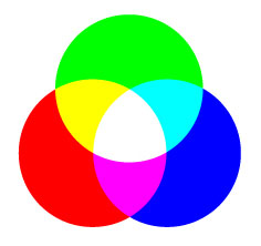
In the natural world, the additive primary colors of red, green, and blue (RGB) interact with one another in unlimited combinations. This simplified illustration represents the effect of the primary colors at maximum intensity. All three colors combine at full strength to produce white. The beauty of RGB is that it closely relates to how we perceive color in the natural world. However, while it is the basis for media that project color through light, such as your computer monitor or television, it is useless in print reproduction.
CMYK
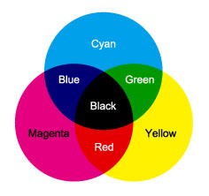
Reflective or subtractive CMY colors are shown here at 100%, separately and in simple combinations. All three colors at this level produce black, but the printing process is best served by a separate black plate. Ink as a printing medium, uses CMYK.
- Color density should be at least 5%, otherwise they may be too light to show up on the actual printed work.
- In except to solid blacks, K value should not exceed 99% for CMYK combined colors or else the other colors may not show up on press.
-
Avoid combined color densities over 200%. For example. do not set color in C100%、M100%、Y100%
、K100%, otherwise it will result in over-saturation and color lifting.
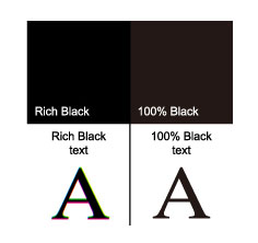
- Black text should be set to K100%, C0%, M0%, Y0% in order to avoid registration problems. Black text created through CMYK combinations may run the risk of other colors showing up on the edges of each letter.
- Black backgrounds that repeat throughout the book should be set to a single PMS color or K100%, C0%, Y0%, K0% in order to ensure the colors off press match from page to page.
- Colored backgrounds that repeat throughout numerous pages should be set to a single PMS color in order to ensure the colors off press match from page to page.
- Solid colors that cover a large area of a page (such as single color endsheets) should be set to a single PMS color rather than a CMYK process in order to ensure the even distribution of color throughout the page.
- Due to its heavier ink density, metallic PMS colors will overlap all other colors if not separated from other colors. To prevent the color from turning out incorrectly on press, the layering options on artwork that contain metallic PMS should be unchecked
- For vector graphics, do not use spot color.
- All spot colours should be designated as spot colors and not as CMYK recipes.
|

|
- For PC and MAC users, please supply fonts that are not commonly used as Choice may not have the same selection of fonts available. If this is not possible, please embed fonts as images before artwork is submitted
- Embed all fonts and images before sending final artwork. Failure to do so may result in alternate styles being automatically selected.
- If job fail while distilling, check the job for missing fonts. The following settings recommend canceling the job when fonts are missing to ensure the document prints correctly.
- To guarantee the font information is successfully included in the Adobe PDF file and will view properly on the monitor, the required fonts should reside either in the system folder of the computer or in the PostScript file.
|

|
- All graphics should be created under CMYK setting, not RGB. Ideal resolution should be at least 350dpi. Any lower than 350dpi may result in blurry, bitmapped, or pixilated images.
- Outlines or borders should be above 0.2mm (0.57PT) to insure that lines will show up on press.
- When using “link” or “embed” for graphics by Illustrator, all the images should be flattened before being saved as a file.
- Creative effects, such as drop shadows and transparency, reply on effective flattening of the file before output, otherwise the final output will often encounter problems,
- If artwork is in EPS format, it should be an EPS with a single file only, not in DCS format.
|

|
- Please use CMYK for all colors, not RGB.
- Printed colors may differ on different types of paper due to the paper’s color, opacity, or brightness. Even post-work may affect final color. Films and lamination cause colors to darken and redden after its application. Therefore, projects that require matte PP lamination or spot UV should have their colors adjusted beforehand.
- We will reproduce color from submitted images, transparencies, slides, photos, or digital layouts as closely as possible, but cannot exactly match color and density because of limitations in the printing process, as well as neighboring image ink requirements. The accuracy of each color reproduction is to be within 85-90% of the original image you submitted.
- Because every printer uses different brands of paper and ink and are exposed to different climates and humidity, we do not recommend the use of another printer’s product as a sample to guide the color. Additionally, colors shown on computer screen or outputted through a digital printer are also not a reliable method of measuring color accuracy.
|
 |
If spot UV, foil stamp, emboss / deboss, die-cut or other post-works are required, please supply separate artwork for each type of finishing and make sure the positioning is accurate to avoid registration problems. |
|
| |
|
|